UX DESIGN
UX DESIGN
ShareOn
ShareOn
ShareOn
Because "wait, who's paying for this?" should never be a group chat debate.
Because "wait, who's paying for this?" should never be a group chat debate.

The starting point
The starting point
A subscription management app that answers the question most people can't answer off the top of their head: what am I actually paying for, with whom, and when does it hit my account?
A subscription management app that answers the question most people can't answer off the top of their head: what am I actually paying for, with whom, and when does it hit my account?
A subscription management app that answers the question most people can't answer off the top of their head: what am I actually paying for, with whom, and when does it hit my account?

The problem
The problem
When a destination is genuinely unknown, a planet you can't picture at human scale, standard booking flows stop working. The gap between "I'm curious" and "I'm deciding" becomes impossible to cross. The real challenge was cognitive.
When a destination is genuinely unknown, a planet you can't picture at human scale, standard booking flows stop working. The gap between "I'm curious" and "I'm deciding" becomes impossible to cross. The real challenge was cognitive.
When a destination is genuinely unknown, a planet you can't picture at human scale, standard booking flows stop working. The gap between "I'm curious" and "I'm deciding" becomes impossible to cross. The real challenge was cognitive.

Four kinds of users
Four kinds of users
The same user moves through different states depending on where they are in the app.
The Unaware
They don't know what they spend. They need one clear number before anything else.
The Partially Aware
They suspects the real number is higher than they think. They need a frame that makes the data readable, not just a list of charges.
The Active Manager
They already wants to act. They need to get there fast, with no friction in the way.
The Shared-Account
They have social complexity on top of the financial one. The app has to handle the coordination they're currently doing manually, in group chats, imperfectly.
The same user moves through different states depending on where they are in the app.
The Unaware
They don't know what they spend. They need one clear number before anything else.
The Partially Aware
They suspects the real number is higher than they think. They need a frame that makes the data readable, not just a list of charges.
The Active Manager
They already wants to act. They need to get there fast, with no friction in the way.
The Shared-Account
They have social complexity on top of the financial one. The app has to handle the coordination they're currently doing manually, in group chats, imperfectly.
The same user moves through different states depending on where they are in the app.
The Unaware
They don't know what they spend. They need one clear number before anything else.
The Partially Aware
They suspects the real number is higher than they think. They need a frame that makes the data readable, not just a list of charges.
The Active Manager
They already wants to act. They need to get there fast, with no friction in the way.
The Shared-Account
They have social complexity on top of the financial one. The app has to handle the coordination they're currently doing manually, in group chats, imperfectly.
How I got there
How I got there
I structured the app around three things user research kept surfacing: overview, ownership, control. Not as feature categories but as the actual sequence in which people think about subscriptions. First understand the landscape, then figure out who's responsible for what, then act. The information architecture follows that order.
I structured the app around three things user research kept surfacing: overview, ownership, control. Not as feature categories but as the actual sequence in which people think about subscriptions. First understand the landscape, then figure out who's responsible for what, then act. The information architecture follows that order.
I structured the app around three things user research kept surfacing: overview, ownership, control. Not as feature categories but as the actual sequence in which people think about subscriptions. First understand the landscape, then figure out who's responsible for what, then act. The information architecture follows that order.

The decisions that shaped it
The decisions that shaped it
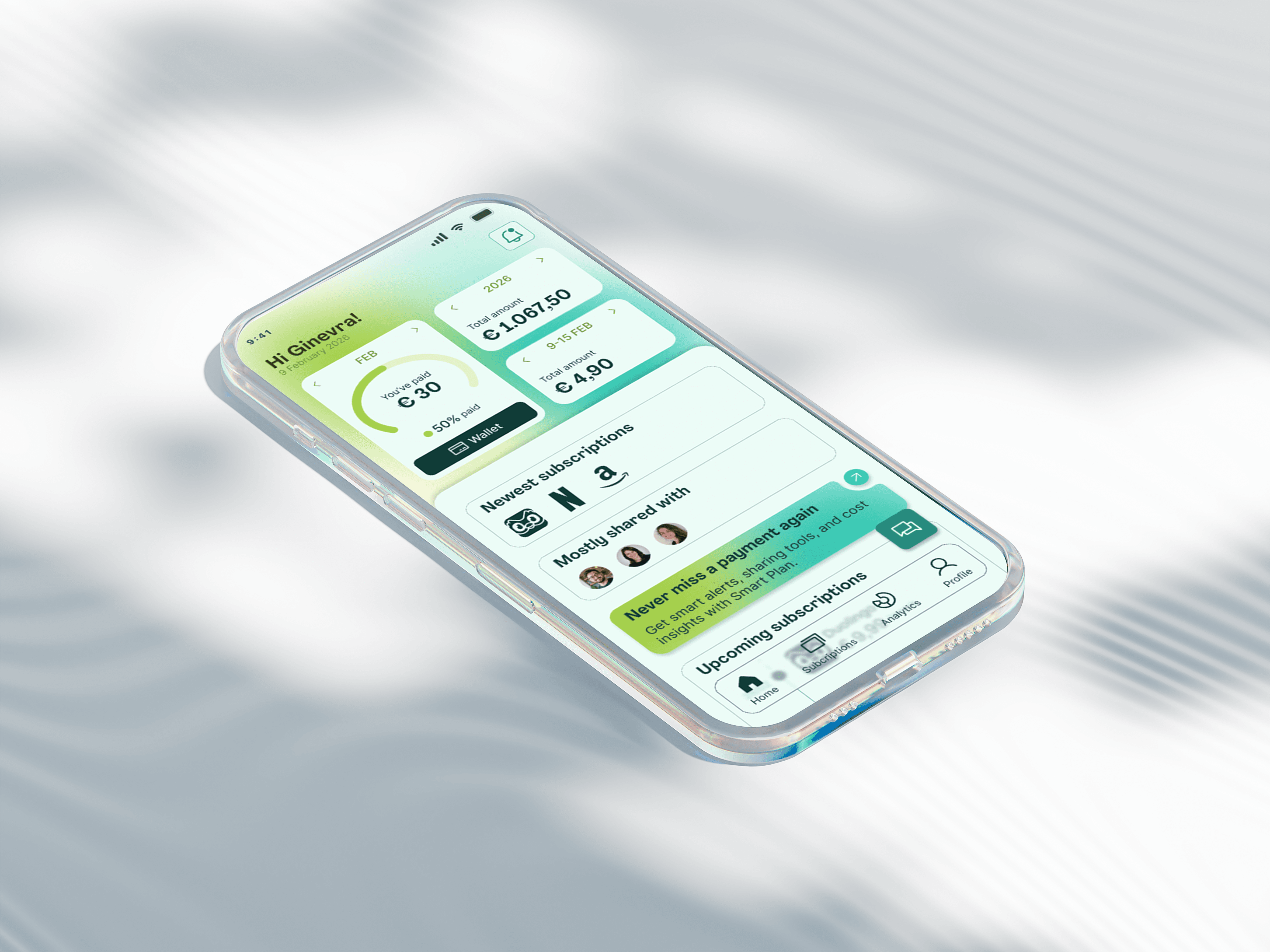
The homepage leads with time-based summaries, not a list. Weekly, monthly, yearly views translate scattered payments into something you can actually understand before doing anything else.
The homepage leads with time-based summaries, not a list. Weekly, monthly, yearly views translate scattered payments into something you can actually understand before doing anything else.
The homepage leads with time-based summaries, not a list. Weekly, monthly, yearly views translate scattered payments into something you can actually understand before doing anything else.
Complexity is staged by intent. Analytics, splitting, projections surface when the user has enough context to find them useful.
Complexity is staged by intent. Analytics, splitting, projections surface when the user has enough context to find them useful.
Complexity is staged by intent. Analytics, splitting, projections surface when the user has enough context to find them useful.


The blurred paywall was a design experiment. Visibility tells users something exists. It doesn't tell them why it matters to them specifically. That needs context, not just exposure.
The blurred paywall was a design experiment. Visibility tells users something exists. It doesn't tell them why it matters to them specifically. That needs context, not just exposure.
The blurred paywall was a design experiment. Visibility tells users something exists. It doesn't tell them why it matters to them specifically. That needs context, not just exposure.
Shared payments are handled inside the app. Who owes what, confirmation states, payment history, so a shared subscription requires as little coordination as a private one.
Shared payments are handled inside the app. Who owes what, confirmation states, payment history, so a shared subscription requires as little coordination as a private one.
Shared payments are handled inside the app. Who owes what, confirmation states, payment history, so a shared subscription requires as little coordination as a private one.
What stuck with me
What stuck with me
Financial tools get heavy fast. The discipline is subtraction, consistently asking what can be removed without reducing real usefulness.
The paywall experiment was the project's most useful failure.It clarified something that's easy to assume but harder to demonstrate: that showing someone a locked feature and helping them understand what they're missing are two different design problems.
Financial tools get heavy fast. The discipline is subtraction, consistently asking what can be removed without reducing real usefulness.
The paywall experiment was the project's most useful failure.It clarified something that's easy to assume but harder to demonstrate: that showing someone a locked feature and helping them understand what they're missing are two different design problems.
Financial tools get heavy fast. The discipline is subtraction, consistently asking what can be removed without reducing real usefulness.
The paywall experiment was the project's most useful failure.It clarified something that's easy to assume but harder to demonstrate: that showing someone a locked feature and helping them understand what they're missing are two different design problems.

Let's connect!
Let's connect!
Let's connect!
carabottoalice@gmail.com
carabottoalice@gmail.com
carabottoalice@gmail.com
Curious by nature, designer by choice
Curious by nature, designer by choice
© 2026 Alice Carabotto. All rights reserved.
© 2026 Alice Carabotto. All rights reserved.
© 2026 Alice Carabotto. All rights reserved.
Back to top
Back to top